 You are viewing an old version (v. 3) of this page.
<< View previous version | view page history | view next version >>
How to Use the ICEfaces Drag & Drop Functionality
Drag and Drop can be used in ICEfaces to provide GUI features previously only available in traditional desktop applications. In this tutorial we will begin by making a simple Panel Group draggable and attaching a dragListener to communicate with a simple backing bean. We can then make use of Drag and Drop values to record specific data to the backing bean. Drag and Drop masks will reduce unnecessary communication over the ICEfaces AJAX bridge and improve efficiency.
Drag and Drop functionality can be added to any Panel Group. Keep in mind, you can nest any number of ICEfaces and/or HTML tags in a Panel Group. Typically simple images or text are used.
Note about Z-Index: for typical purposes, Draggable Panel Groups should not be obscured by other elements on a page. To avoid this, you can set the Z-Index in the component's CSS style to an arbitrarily high number.
The rest of this tutorial will discuss the following topics:
Creating a Draggable Panel
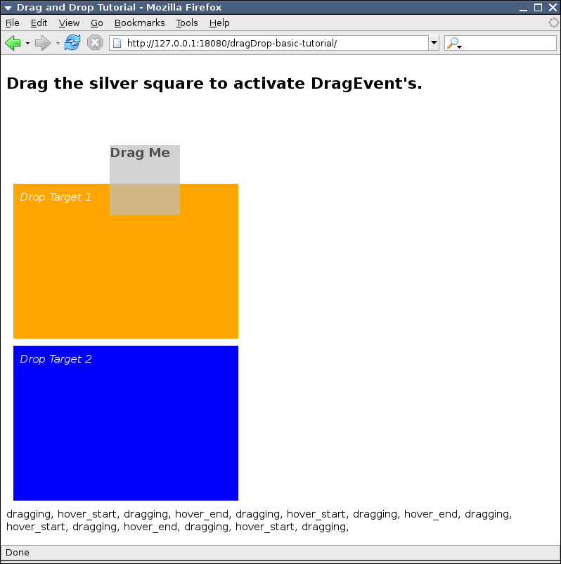
To make a Panel Group draggable, set its draggable attribute to "true".
<ice:panelGroup draggable="true">
    ...
</ice:panelGroup>
We can add some style information and fix the size of the panel to avoid scrollbars that are introduced when moving a Panel Group that is 100% of the page width. Setting the Z-Index ensures that the Draggable Panel is not obscured by other block elements. A background colour makes the outline of the Draggable Panel easily identifiable and distinct from other elements. Finally, the addition of cursor:move to the style will change the mouse cursor to indicate that the Panel can be dragged.
<ice:panelGroup style="z-index:10; width:100px; height: 100px; background-color:silver; cursor:move;"
                draggable="true"
                dragListener="#{dragDropBean.dropPanelListener}">
    <h3>Drag</h3>
</ice:panelGroup>
A dragListener will receive each and every DragEvent by default (see Using Drag and Drop Masks). We can record each event's type and append it to a String, using an outputText to display it.
<h2>Drag message:</h2>
<ice:outputText value="#{dragDropBean.dragMessage}" />
The following code is taken from DragDropBean.java which uses a simple dragListener method to record the event types to a String.
import com.icesoft.faces.component.dragdrop.DragEvent;

...

private String dragMessage = "";

public void dragListener(DragEvent dragEvent){
        dragMessage += ", " + DragEvent.getEventName(dragEvent.getEventType());
}

...

public String getDragMessage () {
        return dragMessage;
In addition to a Draggable Panel, we can add Drop Target Panels. When a Draggable Panel is dropped on a Drop Target Panel, the "dropped" DragEvent will occur. These Drop Targets will also allow the remaining DragEvents to occur.
<!-- Drop Target 1 -->
<ice:panelGroup style="margin:10px; padding:10px; width:300px; height:200px; background-color:orange; color:white;"
                dropTarget="true">
    <em>Drop Target 1</em>
</ice:panelGroup>

<!-- Drop Target 2 -->
<ice:panelGroup style="margin:10px; padding:10px; width:300px; height:200px; background-color:blue; color:white;"
                dropTarget="true">
    <em>Drop Target 2</em>
</ice:panelGroup>
Adding a Data Paginator
The dataTable component is good at displaying large set of data but there are many user interface (UI) scenarios where only a limited subset of the data can or should be shown. The dataPaginator component works in conjunction with the dataTable component allowing manipulation of the view of the dataTable data model. The following screen shot shows two dataPaginator components; the first provides paging navigation control and the other shows the current state of the dataTable model.
Unable to render embedded object: File (dataTable-paginator_screenshot.png) not found.
The first step in adding a dataPaginator control component to a dataTable is to ensure that the dataTable has a unique id attribute assigned to it and that the number of rows in a page view is set via the rows attribute. The dataPaginator components' for attribute is then set to the dataTable id value, this binds the dataPaginator to the dataTable's model. The next step in adding a dataPaginator is to set the attribute paginator to true, this insures that the control links around defined facet controls will be rendered. The following JSF code snippet is of a dataPaginator control where the fastforward and fastrewind facets will move ahead three pages and the maximum number of pages controls shown at the same time is set to four:
<ice:dataPaginator id="dataScroll_3"
                   for="inventoryList"
                   paginator="true"
                   fastStep="3"
                   paginatorMaxPages="4">
    ...
<ice:dataTable rows="5"
               id="inventoryList"
               value="#{inventoryList.carInventory}"
               var="item">
The next step in adding a dataPaginator is to define the facets which will add control links to their child components. There are are six facets which can be optionally implemented; first, last, previous, next, fastforward and fastrewind. The following is the JSF code needed add a first facet which will allow users to click on an image graphic to move to the first page of the dataTable model:
<f:facet name="first">
    <ice:graphicImage url="./xmlhttp/css/xp/css-images/arrow-first.gif"
                      style="border:none;"
                      title="First Page"/>
</f:facet>
The dataPaginator can also be used for displaying information about the dataTable's model by setting the paginator attribute to false (default value). There are several attributes on the dataPaginator component which allow a developer to bind user defined variable names to the dataTable model:
- rowsCountVar – number of rows in the dataTable view model.
- displayedRowsCountVar – number of rows shown in this dataTable view model.
- firstRowIndexVar – index of first row displayed in this dataTable view model.
- lastRowIndexVar – index of the last row displayed in this dataTable view model.
- pageCountVar – number of pages that make up dataTable view model.
- pageIndexVar – current page number in the dataTable view model.
The following code shows how bound user defined variables can be used to display the dataTable's model state:
<ice:dataPaginator id="dataScroll_2" for="inventoryList"
                   rowsCountVar="rowsCount"
                   displayedRowsCountVar="displayedRowsCount"
                   firstRowIndexVar="firstRowIndex"
                   lastRowIndexVar="lastRowIndex"
                   pageCountVar="pageCount"
                   pageIndexVar="pageIndex">
    <ice:outputFormat styleClass="standard"
                      value="{0} cars found, displaying {1} car(s), from {2} to {3}. Page {4} / {5}.">
        <f:param value="#{rowsCount}"/>
        <f:param value="#{displayedRowsCount}"/>
        <f:param value="#{firstRowIndex}"/>
        <f:param value="#{lastRowIndex}"/>
        <f:param value="#{pageIndex}"/>
        <f:param value="#{pageCount}"/>
    </ice:outputFormat>
</ice:dataPaginator>
Adding a Sortable Header
This tutorial has already shown how easy it is to use the dataTable with the dataPaginator component. It is also possible to add sorting support to the dataTable via commandSortHeader. The commandSortHeader component adds a commandLink to the dataTable header which when clicked, will toggle the ordering of the parent column data. The commandSortHeader can be added to all or just of few dataTable headers. The following screen shot shows the commandSortHeader being used in the dataTable-sortable example to sort the inventory by stock number:
Unable to render embedded object: File (dataTable-sortable_screenshot.png) not found.
In this section we will add a commandSortHeader component to each inventory column shown in the previous example. The first step in this process is to modify the TableBean backing bean by extending SortableList.java. The SortableList class is provided for convenience but its functionality could just as easily be added to the base class.
The first step in adding a commandSortHeader is to add the attributes sortColumn and sortAscending to the dataTable component. These two attributes provide bindings which are manipulated when a commandSortHeader is activated. The sortColumn attribute is updated to the column name of the selected commandSortHeader and the sortAscending attribute's boolean value is toggled if the same commandSortHeader is activated. The following JSF code snippet shows the modified dataTable decoration:
<ice:dataTable id="dataSortData"
               sortColumn="#{inventoryList.sortColumnName}"
               sortAscending="#{inventoryList.ascending}"
               value="#{inventoryList.carInventory}"
               var="item">
The next step in updating the dataTable for the commandSortHeader component is to add the component to a column header facet. The following code shows the addition of a commandSortHeader component to the first column.
<!-- Stock number -->
<ice:column>
    <f:facet name="header">
        <ice:commandSortHeader columnName="#{inventoryList.stockColumnName}"
                               arrow="true" >
            <ice:outputText value="#{inventoryList.stockColumnName}"/>
        </ice:commandSortHeader>
    </f:facet>
    <ice:outputText value="#{item.stock}"/>
</ice:column>
The commandSortHeader in this example wraps the output text for the header and adds an arrow which will indicate the ordering applied to the table data. To help avoid typing errors the 'columnName' attribute is bound to the backing bean, the column name is used to specify which column should be sorted.
Now that all the JSF code is in place there is still a little work to be done to the backing bean to get the data sorted. As mentioned earlier, the commandSortHeader component only manipulates the dataTable component's sortColumn and sortAscending attributes and as a result it is up to the table's backing bean to use this information to provide sorted data. The following sort method shows how we sort the dataTable data. Remember that sortColumn is bound to the sortColumnName property and that sortAscending is bound to the ascending property in the TableBean class.
protected void sort() {
    Comparator comparator = new Comparator() {
        public int compare(Object o1, Object o2) {
            InventoryItem c1 = (InventoryItem) o1;
            InventoryItem c2 = (InventoryItem) o2;
            if (sortColumnName == null) {
                return 0;
            }
            if (sortColumnName.equals(stockColumnName)) {
                return ascending ?
                Integer.valueOf(c1.getStock()).compareTo(Integer.valueOf(c2.getStock())) :
                Integer.valueOf(c2.getStock()).compareTo(Integer.valueOf(c1.getStock()));
            } else if (sortColumnName.equals(modelColumnName)) {
                return ascending ? c1.getModel().compareTo(c2.getModel()) :
                c2.getModel().compareTo(c1.getModel());
            } else if (sortColumnName.equals(descriptionColumnName)) {
                return ascending ? c1.getDescription().compareTo(c2.getDescription()) :
                c2.getDescription().compareTo(c1.getDescription());
            } else if (sortColumnName.equals(odometerColumnName)) {
                return ascending ?
                Integer.valueOf(c1.getOdometer()).compareTo(Integer.valueOf(c2.getOdometer())) :
                Integer.valueOf(c2.getOdometer()).compareTo(Integer.valueOf(c1.getOdometer()));
            } else if (sortColumnName.equals(priceColumnName)) {
                return ascending ?
                Integer.valueOf(c1.getPrice()).compareTo(Integer.valueOf(c2.getPrice())) :
                Integer.valueOf(c2.getPrice()).compareTo(Integer.valueOf(c1.getPrice()));
            }  else return 0;
        }
    };
    Arrays.sort(carInventory, comparator);
}
When a commandSortHeader is selected the JSF lifecycle is called and the dataTable values will be retrieved from the backing bean. It is during this dataTable retrieval that the data should be sorted but only if the sortColumnName and sortAscending values have changd. The following code snippet shows the getCarInventory() method has been modified to only sort the array data when required:
public InventoryItem[] getCarInventory() {
    // we only want to sortColumnName if the column or ordering has changed.
    if (!oldSort.equals(sortColumnName) ||
        oldAscending != ascending){
        sort();
        oldSort = sortColumnName;
        oldAscending = ascending;
    }
    return carInventory;
}
In this tutorial we have shown how to add sortable data columns to a dataTable and when combined with the comandSortHeader the dataTable becomes a very flexible and powerful component. The next and last section of this tutorial will take a look at how to customize the dataTable with CSS.
Customising the Data Table CSS style
The ice:dataTable, like most JSF components can be styled using CSS. If no style classes are specified, the component will use a set of default names that are defined in the XP, Royale and Rime CSS sheets. The default style sheet implementation provides header background images and basic border colours. In this part of the tutorial will will focus on two style attributes, columnClasses and rowClasses.
The columnClasses attribute can take one or more CSS class names separated by commas. These classes are then iterated over the total number of columns in the table. For example, if there are six columns in a table and two CSS style classes defined in the columnClasses attribute, then the first column will be given the first defined column style, the second column will be given the second defined column, the third column will be given the first defined style and so on. The iterative style assignment can be quite useful for applying column specific styles to either highlight even and odd columns are to give a particular column specialized styling such as text-alignment. The following code snippet shows how we will define the columnClasses attribute for this example.
columnClasses="stockColumn, modelColumn, desriptionColumn, odometerColumn, priceColumn"
We will be specifying a custom style for each of the five columns. The following code is the CSS that defines the five column styles.
/* common to all columns*/
.stockColumn, .modelColumn, .desriptionColumn, .odometerColumn,
.priceColumn{
    border-right: 1px solid #666666;
    border-bottom: 1px solid #666666;
}

.stockColumn{
    width: 60px;
}

.modelColumn{
    width: 225px;
}

.desriptionColumn{
    width: 150px;
}

.odometerColumn{
    width: 75px;
}

.priceColumn{
    width: 75px;
}
The rowClasses attribute is used the same way as the columnClasses attribute by the dataTable renderer. Instead of specifying a style class for each row we will specify two style classes which will be applied to every odd then even row of the dataTable. The following screen shot shows what the dataTable looks like with both columnClasses and rowClasses decorations.
Unable to render embedded object: File (dataTable-style_screenshot.png) not found.
The dataTable renders an HTML table as the main construct for the rendered dataTable component. The styleClass attribute value will be rendered as a class attribute for the rendered table. If you wish to change the default header styles you must override ICEfaces' predefined CSS names. These names are as follows:
| CSS Class Name | Description |
|---|---|
| iceTblHeader | Default CSS class name applied to all table header cells. |
| iceTblHeader a | Default CSS style applied anchor tags in a table header cell. |
Tutorial Source Code Downloads
| Example | Source | Notes |
|---|---|---|
| dataTable-basic | [dataTable-basic source code |^dataTable-basic-tutorial.zip|Download Source Code] | Simple example of how to dispaly data uses a dataTable component. |
| dataTable-paginator | [dataTable-paginator source code |^dataTable-paginator-tutorial.zip|Download Source Code] | A dataPaginator is added to the dataTable used in dataTable-basic |
| dataTable-sortable | [dataTable-sortable source code |^dataTable-sortable-tutorial.zip|Download Source Code] | CommandSortHeaders are added to each column in a data table. |
| dataTable-style | [dataTable-style source code |^dataTable-style-tutorial.zip|Download Source Code] | The row and column classes are altered with CSS. |