 You are viewing an old version (v. 5) of this page.
<< View previous version | view page history | view next version >>
How to Use the ICEfaces Drag & Drop Functionality
Drag and Drop can be used in ICEfaces to provide GUI features previously only available in traditional desktop applications. In this tutorial we will begin by making a simple Panel Group draggable and attaching a dragListener to communicate with a simple backing bean. We can then make use of Drag and Drop values to record specific data to the backing bean. Drag and Drop masks will reduce unnecessary communication over the ICEfaces AJAX bridge and improve efficiency.
Drag and Drop functionality can be added to any Panel Group. Keep in mind, you can nest any number of ICEfaces and/or HTML tags in a Panel Group. Typically simple images or text are used.
Note about Z-Index: for typical purposes, Draggable Panel Groups should not be obscured by other elements on a page. To avoid this, you can set the Z-Index in the component's CSS style to an arbitrarily high number.
The rest of this tutorial will discuss the following topics:
Creating a Draggable Panel
To make a Panel Group draggable, set its draggable attribute to "true".
<ice:panelGroup draggable="true">
    ...
</ice:panelGroup>
We can add some style information and fix the size of the panel to avoid scrollbars that are introduced when moving a Panel Group that is 100% of the page width. Setting the Z-Index ensures that the Draggable Panel is not obscured by other block elements. A background colour makes the outline of the Draggable Panel easily identifiable and distinct from other elements. Finally, the addition of cursor:move to the style will change the mouse cursor to indicate that the Panel can be dragged.
<ice:panelGroup style="z-index:10; width:100px; height: 100px; background-color:silver; cursor:move;"
                draggable="true"
                dragListener="#{dragDropBean.dropPanelListener}">
    <h3>Drag</h3>
</ice:panelGroup>
A dragListener will receive each and every DragEvent by default (see Using Drag and Drop Masks). We can record each event's type and append it to a String, using an outputText to display it.
<h2>Drag message:</h2>
<ice:outputText value="#{dragDropBean.dragMessage}" />
The following code is taken from DragDropBean.java which uses a simple dragListener method to record the event types to a String.
import com.icesoft.faces.component.dragdrop.DragEvent;

...

private String dragMessage = "";

public void dragListener(DragEvent dragEvent){
        dragMessage += ", " + DragEvent.getEventName(dragEvent.getEventType());
}

...

public String getDragMessage () {
        return dragMessage;
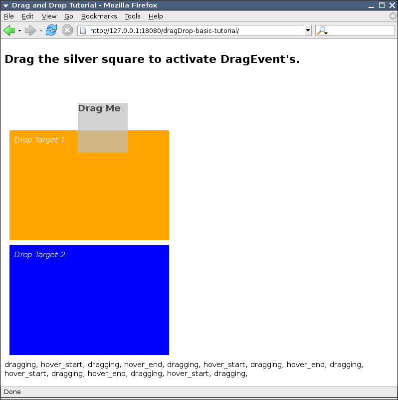
In addition to a Draggable Panel, we can add Drop Target Panels. When a Draggable Panel is dropped on a Drop Target Panel, the "dropped" DragEvent will occur. These Drop Targets will also allow the remaining DragEvents to occur.
<!-- Drop Target 1 -->
<ice:panelGroup style="margin:10px; padding:10px; width:300px; height:200px; background-color:orange; color:white;"
                dropTarget="true">
    <em>Drop Target 1</em>
</ice:panelGroup>

<!-- Drop Target 2 -->
<ice:panelGroup style="margin:10px; padding:10px; width:300px; height:200px; background-color:blue; color:white;"
                dropTarget="true">
    <em>Drop Target 2</em>
</ice:panelGroup>
Drag Values and Drop Values
Draggable panels can be assigned values. These values will be contained in the DragEvent received by a dragListener in the Backing Bean. Although they support value binding expressions for their values, a simple String will provide an adequate demonstration of their use.
We can assign each of the Drop Targets the values "Target 1" and "Target 2" for their Drop values. An outputText element on the Draggable Panel itself will display the stored String.
<!-- Drop Target 1 -->
<ice:panelGroup dropValue="Target 1"
                style="margin:10px; padding:10px; width:300px; height:200px; background-color:orange; color:white;"
                dropTarget="true">
    <em>Drop Target 1</em>
</ice:panelGroup>

<!-- Drop Target 2 -->
<ice:panelGroup dropValue="Target 2"
                style="margin:10px; padding:10px; width:300px; height:200px; background-color:blue; color:white;"
                dropTarget="true">
    <em>Drop Target 2</em>
</ice:panelGroup>

Drag and Drop Masks
Drag and Drop masks can be used to prevent certain Drag and Drop events from initiating a server round-trip. By masking unnecessary events, the application will make more efficient use of resources and increase performance.
The attributes dropMask and dragMask of a Panel Group can be assigned a comma-separated list of values corresponding to the different event masks.
- hover_start: started to hover over a drop target
- hover_end: stopped hovering over a drop target
- dragged: is being dragged (not necessarily moving)
- dropped: has been dropped on a drop target
- drag_cancel: has been dropped but not on a drop target
Typically, we will only want to listen for only one or two of these events. In this tutorial we're only interested in "dropped" events.
<!-- Draggable Panel -->
<ice:panelGroup style="z-index:10; width:100px; height: 100px; background-color:silver; cursor:move;"
                draggable="true"
                dragMask="hover_start, dragging, hover_end, drag_cancel"
                dragListener="#{dragDrop.dragListener}">
    <h3>Drag Me</h3>
    <ice:outputText value="#{dragDrop.dropValue}" />
 </ice:panelGroup>

Drag and Drop Options
Similar to the Drag and Drop masks, Drag and Drop options are defined in a comma-separated list of values for the attribute dragOptions. These options affect the visual nature of the dragging itself:
- revert - when a draggable is dropped, the draggable will move back to it's starting position.
- ghosting - when a draggable is dragged, a ghost copy is left in the original position.
- solid - do not make the panel transparent when dragging.

Tutorial Source Code Downloads
| Example | Source | Notes |
|---|---|---|
| dragDrop-basic | dragDrop-basic source code | Basic example of how to setup a Draggable Panel and its backing bean. |
| dragDrop-values | dragDrop-values source code | Drag and Drop values are used to assign a String in a backing bean. |
| dragDrop-masks | dragDrop-masks source code | Drag and Drop masks are used to prevent unneccessary DragEvent's from firing. |
| dragDrop-options | dragDrop-options source code | Different Drag and Drop options are shown (ghosting, revert, etc.). |